Size Shape Colour
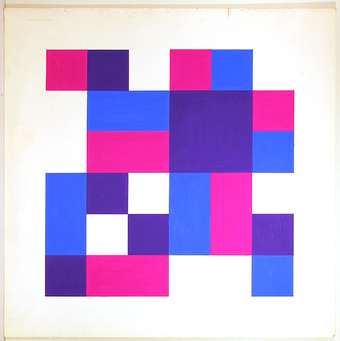
Rokus van Blokland taught the subject of Optical Grammatical Studies for decades as a teacher. Together with his students, he investigated the basics of design; the relationship between size, form, and colour.
This research also formed the basis of his own work, in both his spatial work and his drawings and paintings.
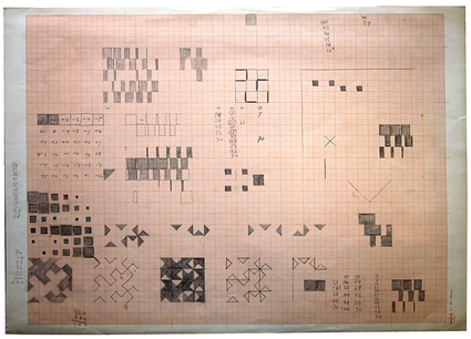
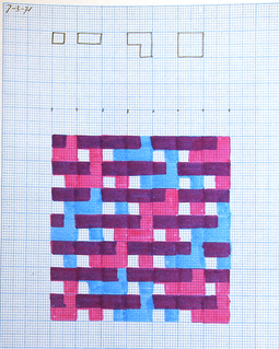
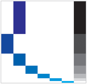
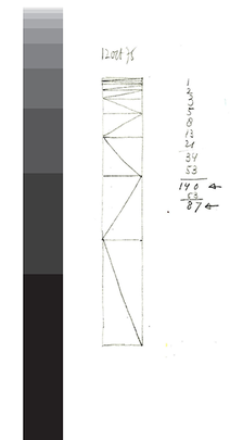
Rokus experimented with rhythms, proportions, color, and contrast. His painting from 1966, Light-Dark Contrast was created by changing the amounts of black and white in a series he determined. He made preparatory studies of this in gouache.
Digital editing of his designs
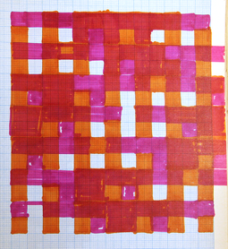
Rokus pushed the boundaries of what was possible with his colour experiments. In his designs, he often surpassed the actual making process. According to Rokus, commercially available colours were often "contaminated" with in his eyes unwanted colorants. That's why he mixed his own colours from a limited basic palette of high-quality oil paint. The search for the right colour was time-consuming.
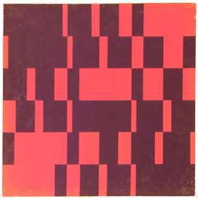
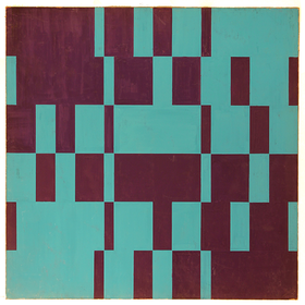
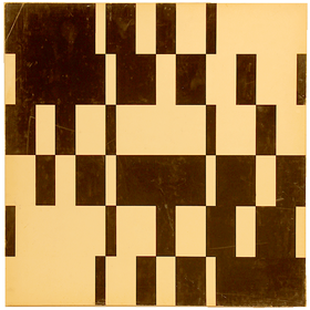
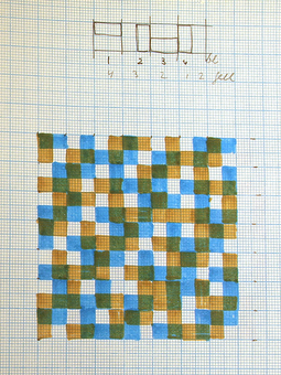
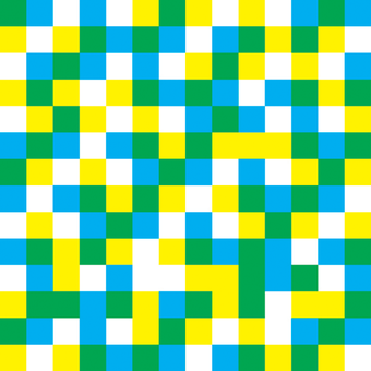
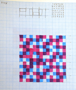
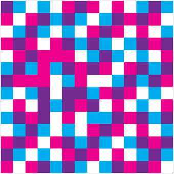
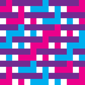
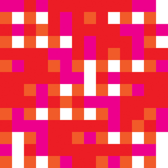
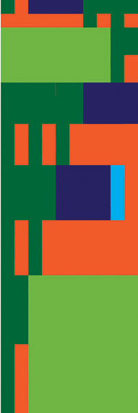
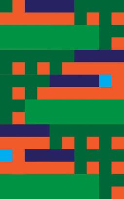
In addition, Rokus was limited in his research because at the time he began his colour paintings (in the 1960s and 70s), there were no computers to assist him in his often mathematical approach. Number sequences, color saturation, surface sizes, contrasts. However, computers are now available. Below are some digitally rendered colour designs by Rokus made in 2014.
